 Data tracking is becoming a popular practice in very different domains ranging from sports to health, work productivity and learning, among others. The availability of personal informatics tools is allowing a growing number of users to have access to their personal data. Initiatives such as the Quantified Self open the door for self-knowledge through numbers. One of the questions that emerge from this context is how to make this data meaningful for users.
Usually, this extensive amount of data is presented in a visual way in order to make easier the detection of trends and patterns that otherwise would require a huge memory. The visualization of information can help users’ understand their habits and behavior and therefore, improve awareness and self-reflection.
Two areas in which the advances of data tracking are quite active are sports and learning. In sports, some of current well-known products focused on body tracking are Nike+ and its fuelband, Fitbit, Philipps directlife, Adidas Mycoach, RunKeeper and Striiv. All of them offer opportunities to the users to learn about their progression and undertake new challenges. A shared characteristic in many of these tools is that they make an intensive use of infovis in order to show the users’ performance.
Learning analytics is another field to take into consideration when understanding how to better give feedback to learners and teachers about the data that has been tracked. In this case, as Duval (2011) suggests “For learners and teachers alike, it can be extremely useful to have a visual overview of their activities and how they relate to those of their peers or other actors in the learning experience”. Usually the sort of data that is tracked in learning analytics systems consists in the number of activities submitted by the student, the number of communications, time spent on tasks, …etc. Under this approach, qualitative aspects, such as the students’ welfare, that might have an impact on the learning performance are totally left aside.
Among others, two indicators closely related to well-being are a person’s stress and recovery levels. In this line, a recent study about “Everyday rythms and practices related to “objective” and “subjective” well-being” carried out by the National Consumer Research Centre showed that stress and recovery levels have an impact on the well-being of a person. The research highlighted that in order to determine the level of well-being, it was crucial to analyze the length and quality of the recovery moments. In this sense, how fast and how well a person recovers after a stress period was strongly influenced by that persons’ lifestyle.
Although stress and training effectiveness have been at the center of many researches during the past several decades, there has been very little research intended to integrate these two areas (Le Pine et al., 2004). In learning analytics, indicators dealing with the students’ stress levels and how they feel about are not taken into consideration when, actually, they could provide useful insight about their learning capabilities. Besides, the integration of this information in a learning environment could contribute to develop more personalized approach to learning.
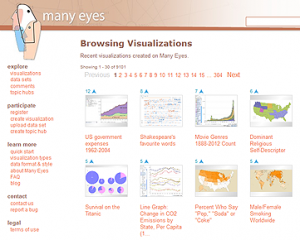
Despite the appearance of information visualization tools easily accessible for a broad audience, such as Many eyes, Gapminder, Timelinejs, its use in educational settings is still quite marginal. In this sense, visualizations, understood as a shared external representation, can become boundary objects (Star, 1989) that support discussion between divergent viewpoints. From this perspective, information visualization connects with the knowledge creation framework of learning (Lipponen, Hakkarainen & Paavola, 2004) in which, according to the authors “The defining characteristic of creative collaboration is that it is focused on advancing certain shared objects, knowledge-laden or conceptual artifacts and the agents’ relationship to them.” (pp.12).
Following the knowledge creation approach, we consider that the creation a goal oriented visualization (Duval, 2011) that helps relating the students’ well-being with their learning patterns will be a useful tool that mediates and transforms the students’ knowledge building about themselves. The design of a dashboard that combines objective and subjective well-being indicators such as the students’ stress and recovery levels and their mood, with their learning performance will allow users reflect about their lifestyle and, when considered necessary, take action to improve their learning. Digital dashboards are critical data visualization tools that do not have to necessarily rely on computer screens. In this sense, more innovative proposals about how users interact with the visual displays of information in a given space would augment the role of infovis as boundary objects that mediate knowledge building processes.
References
Duval, E. (2011). Attention Please! Learning Analytics for Visualization and Recommendation. To appear in: Proceedings of LAK11: 1ST International Conference on Learning Analytics and Knowledge 2011.
LePine, J.A., LePine, M.A. & Jackson C.L., (2004). Challenge and Hindrance Stress: Relationships With Exhaustion, Motivation to Learn, and Learning Performance. Journal of Applied Psychology, 89 (5): 883–891.
Lipponen, L., Hakkarainen, K. & Paavola, S. (2004). Practices and orientations of computer-supported collaborative learning. In J. Strijbos, P. Kirschner & R. Martens (eds.). What we know about CSCL, and implementing it in higher education (pp. 31-50). Boston, MA: Kluwer Academic Publishers.
Star, S.L. (1989). The structure of ill-structured solutions: boundary objects and heterogeneous distributed problem solving. In R. Glaser & M.N. Huhns (Eds.), Distributed artificial intelligence: Volume II (pp. 27-54). London: Pinnan.


Pingback: feeler game | evadurall
Pingback: feeler | evadurall
Pingback: Learning Environment research group’s year 2014 summarized | LeGroup