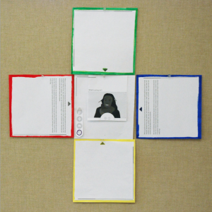
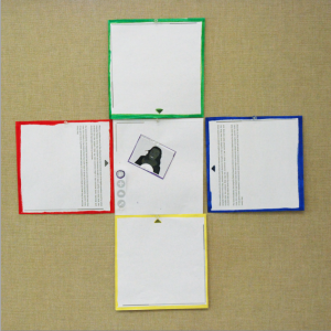
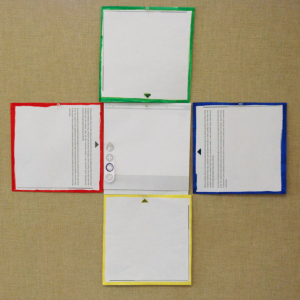
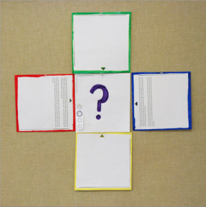
During two prior participatory design sessions with girls in the ACORD Woodland public school in Oakland, California we started developed software ideas for the interaction design and functionality of the central device of the Square1 set of devices. The main ideas included (1) a way for children to record audiovisual messages about their project progress, to practice presentations and to include as media in their presentations (much like TeamUp and ReFlex), (2) a screenshot function for clustering and potentially saving screen content, (3) a function for browsing the internet and storing media in a library to be accessed later, and (4) a tool for planning multi-device presentations. The images above show paper prototypes of these tools. As we did not discuss the tool for planning multi-device presentation in detail, the paper prototypes were used to design of this tool in a participatory design session with girls in a another Oakland public school.
The third participatory design session was again facilitated in context of the techGyrls mentor program of the YWCA Berkeley/Oakland. This time, the program coordinator, Jana, and I facilitated the workshop with 13 girls (4th grade) at the La Escuelita public school in Oakland, California. None of the girls participated in the research before.
The Square1 design concept and the reasons for asking them to participate in the design of the tool were given. The girls were asked if they would like to participate in a design workshop that is similar to what happens in a design studio and to try using paper, scissors, glue and pencils to create paper-prototypes of their ideas. There were no right or wrong ideas, it was all about exploring, having fun and coming up with interesting ways to interact. The girls were further told that we would build on ideas of the girls from the ACORN Woodland school who participated in previous workshops. After agreeing to participate, we split into three groups. Two groups of four girls and one group of five. The main task was to design an interface for planning your presentation using the central device. Probing subquestions included:
- How would you ensure that everyone gets to present?
- How would you assign content to each device?
- Make paper buttons for your interface. Where would they go? What would they do?
- How would you represent the time and length of your presentation?
- Imagine an animation would run across two device screens. How would you plan that?
Two of the three groups were joined by a mentor, Jana and me. One group was working without a mentor. The groups with mentors were lead into the task by identifying ideas of for a presentation topic and the needed kind of information first. It is interesting to note that the two mentored groups used a lot of time for this starting exercise, while the group without mentors immediately started with the design task. In the end of the session, the groups presented their ideas.
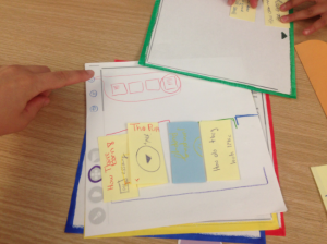 The group of girls I worked with ideated a presentation planning interface, in which the flow of the presentation is arranged on a timeline on the bottom of the screen. First, all devices would have to be stacked. The central device would be on top. When clicking a button on the central device, a representations of the screens of each connected device appear above the timeline visualization. From there, content could be rearranged, onto the timeline and be distributed to the other devices through swiping motions. The video above and the photo of the paper prototype illustrated this idea.
The group of girls without a mentor ideated, for example, a way of using multiple screens in online collaboration. Instead of enabling a screen-sharing function, a person would simply hold one screen in front of the camera to show the person online what they are working on (see video above).
The documentation of the third groups ideas will follow soon.

